HELPY BRINGS TOGETHER CORPORATE SERVICES AND A KNOWLEDGE BASE FOR YANDEX EMPLOYEES


TEAM
Product Manager, Developers
ROLE
Product designer
YEAR
2024
Helpy helps employees quickly solve work and HR-related tasks: request corporate services, get access permissions, order equipment, find essential information, and interact with the company’s internal services. The portal is used by employees every day and is one of the key tools for handling operational tasks inside the company.


PROBLEM
At the start of the project, the portal had an outdated design and was gradually falling out of sync with the broader HRTech ecosystem. The interface did not use the department’s design system, while the structure of the homepage had grown more complex over several years. The business request was not limited to refreshing the visual layer. We needed to rethink the user experience, make the portal more useful and engaging for employees, and prepare it for integration into the Ya.Team mobile app.

RESEARCH
Before the redesign, it was important to understand how employees used the portal, which scenarios were most common, and which homepage blocks were genuinely valuable. To do this, we conducted 30 in-depth interviews with users of different ages, professions, and levels of experience at Yandex. The research showed that the most-used homepage blocks were “My requests,” “Wi‑Fi,” and “Favorites.” Users also expressed interest in news and recommendation blocks. At the same time, we learned that most employees came to the portal with a specific task and started with search. However, search was unstable and did not always help people quickly find the service they needed. As a result, users had to look for it manually through the catalog, increasing the path to the target action and creating extra frustration.
KEY HYPOTHESES
Improve search and make it the primary way to interact with the portal. Smart search should suggest similar queries and help employees find the right services faster. By giving search more weight in the interface, we could shorten the path to the desired action and support the most frequent user scenario.

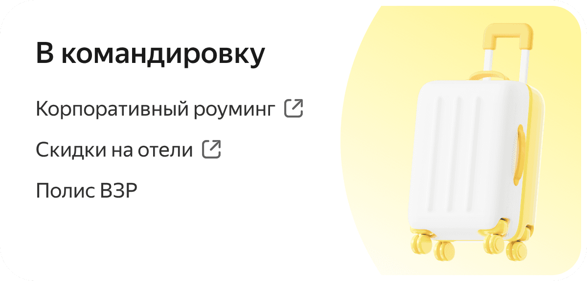
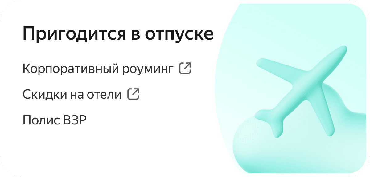
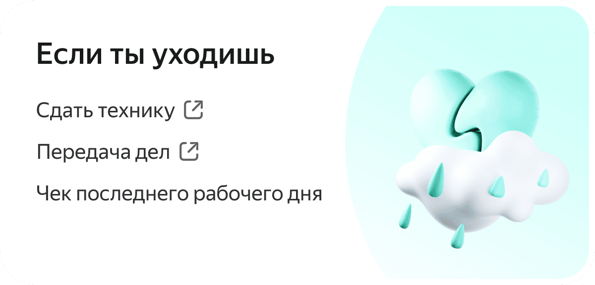
Add situational widgets based on an employee’s current work context — vacation, sick leave, dismissal, business trip, with data pulled from the employee account. This would personalize the portal experience, surface relevant services at the right time, and increase employee engagement with the product.




Remove visual noise from the homepage and build a calmer visual hierarchy. This would reduce cognitive load and focus the user’s attention on key actions instead of forcing them to navigate many competing blocks.

RESULT
As a result of the redesign, the portal received a new visual style and was aligned with the HRTech design system. The homepage became more focused on key user scenarios, with search taking a central role in navigation. After launch, we ran an internal employee survey to collect feedback. Users responded positively to the updated interface, highlighting its more modern look, clearer homepage structure, and easier service search. The project also laid the foundation for further development of the knowledge base and for scaling the portal as a single access point to the company’s internal services and information.
Office selection

Service request flow

Mobile version in Ya.Team

CASE STUDIES
ARE AVAILABLE ON DESKTOP